4 Steps to Make Your Mail.app Widescreen
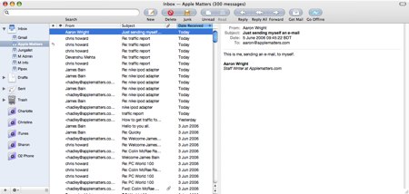
Without delving into the good and bad points of Mail.app for OS X, a couple of its features are limited compared to other mail applications. One thing I had missed when moving from Windows, using Outlook, to OS X, using Mail, was the three pane view which stretched across the screen. Mail does have three panes now, but two of them (the e-mail list and then the e-mail preview) are stacked on top of each other.
So, what to do? Luckily, someone has developed a simple and hassle free plug-in which takes little to no time at all to install.
Step 1—Backing Up
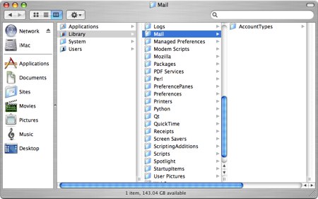
First and foremost, make a backup of your e-mails by copying the folder ~/Library/Mail (where ~ is your home user directory). You may want to burn it to disc, or just move it to another location on your computer. I have of course tested the Widescreen Mail plugin and I didn’t notice any hiccups, but it’s always better to be safe than sorry, right? Should things go wrong, all you have to do is copy the folder above back into it’s original location—so put the folder /Mail back in the folder /Library in your home user directory.

I’d also like to point out that everything you do from here-on, you do so at your own risk. As I said, there’s nothing wrong with the plugin and it’s very unlikely anything will go wrong, but Apple Matters and myself should not be held responsible for your actions.
Before we proceed, download the plugin directly from its source. Once done, unzip and follow step 2.
Step 2—Telling OS X you want to install a plugin
Before you continue though, have you ever installed a plugin for Mail before? If so, close Mail.app and then simply copy the contents of the downloaded pack to ~/Library/Mail/Bundles/.
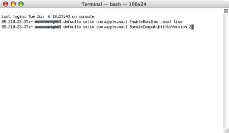
If you’ve not installed a plugin for Mail before, close Mail.app and then open up Terminal, which can be found under Utilities in your Applications folder, and type in the following:
defaults write com.apple.mail EnableBundles -bool true
defaults write com.apple.mail BundleCompatibilityVersion 2

What this does is tells OS X that you plan to install a plugin for a particular application. It might worry you a little, but please don’t let it. Apple wouldn’t have included Terminal into the operating system if it wasn’t supposed to be used for instances like this. After you’ve entered the two lines of code above, you won’t notice any confirmation messages—just make sure you’ve entered it as I’ve entered it. Better still, just copy what I’ve written.
Step 3—Creating the plugin folder
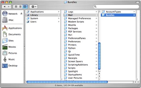
Once you’ve told OS X you plan to install a plugin for Mail.app, you’ll need to drop the plugin into its destination folder. Open up ~/Library/Mail/ and create a folder called Bundles - this is now where future plugins for Mail.app will be placed. Drop MailWidescreen.mailbundle (the plugin you downloaded) into the folder you’ve just created (Bundles).

Step 4—Open Mail with anticipation
That’s it. Open up Mail.app and you should see Mail with three panes stretched out over the screen, it looks quite nice as well and has certainly made me feel more at home with Outlook. You shouldn’t notice any problems, but of course, they do happen. I’ve tested this plugin with OS X 10.4.6 Tiger, although I’m told it will work on earlier versions of Tiger as well.

Uninstalling
If you don’t like the look of MailWidescreen or it doesn’t work and you want to remove it from your system: Close Mail.app and simply locate ~/Library/Mail/ and delete the folder Bundles entirely from your system. When you re-open Mail.app again, you’ll see everything back as it was before.


Comments
I tried this plugin (about a week ago when it was shown on one of the many Mac blogs I have rss feeds for) and decided that I like the default view better. But when I tried to uninstall the plugin, I had to reset my entire mail program by adding in the accounts again (a pain when you have 6 email accounts).
Be careful.
MacGlee: This is hardly to make mail.app look like Outlook. Vertical panes have been used for mail for a long time (back to text interfaces and X11 programs). The view is nice and the space is better used in a widescreen monitor if mail.app is set-up this way (as it’s the same orientation of the monitor itself).
Obviously, it’s subjective. You should not use it because it doesn’t fit your style or you are not convinced by the different layout, but deciding not to use something because it looks similar to outlook is not the best of reasons, to my eyes.
Great steps. Thanks a lot for making this tutorial to us who are beginners. PMP Certification